

I am brand new to the world of Canvas Apps. As soon as I started building headers and menus and other things, I began to wonder if there was a way to create a repository of reusable components. After a little searching, I discovered Component Libraries! More recently, I also discovered they can be built into solutions and used across multiple environments. Let’s take a look!
Disclaimer: At the time of writing, Component Libraries are in Public Preview. This means that it is a stable feature but it is reasonable to expect some bugs. Features in Public Preview are usually released to General Audiences shortly after. You can learn more about Preview Features here.
First things first, create the solution you would like to house your Component Library in. While I was working through this, I did notice that I could not import a Component Library into a solution, it had to of been created from within my solution first. Best practice to house your Component Library in its own solution anyway. So go ahead and get that done first:
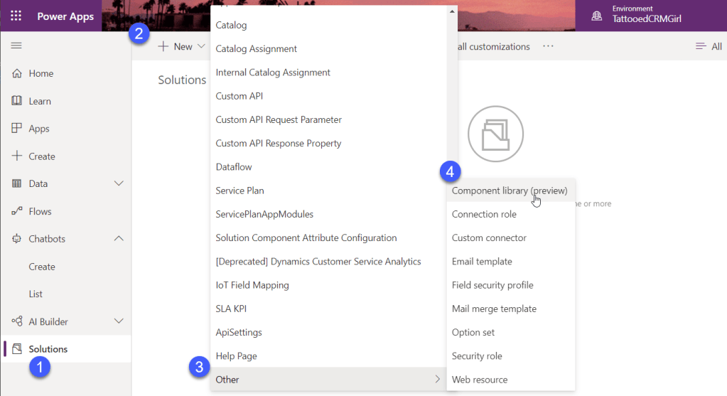
Upon clicking on the Component Library (preview), the Create PowerApps screen will open and a Component called Component1 will be pre-generated for us.
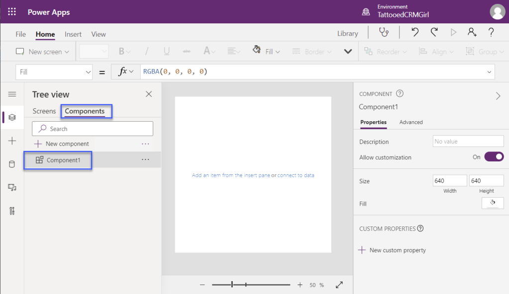
To fully explain how Components work, I will build out a header Component within our Library. Once my component is built, I can set properties on the component to be re-used across different apps. In this case I will add a component property for the text and a component for the image.
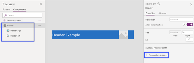
Component Properties can be anything from a simple text label to a table and anything in between.
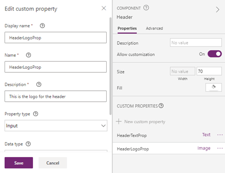
Once the Component properties are set, we now need to tell the Component what values it should use for its various parts. For example, if the end user wants to change the Header Text label, we will instruct the Component to read that value from the user’s input:
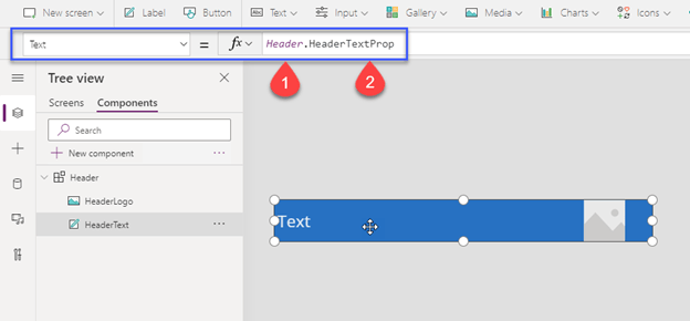
So the formula is structured like this:
- Header refers to the name of the Component.
- HeaderTextProp refers to the name of the component.
The formula says – whatever value the user sets for the header text in the Component Properties list, apply that value to this Text Label.
So let’s look at how this works. First we need to add the Component to the Screen.
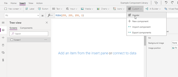
Once added, we will be given the option to set Component Properties:

When I change these Properties, I am changing this instance of the component within the app.
**NOTE** If the component’s core properties are changed, that change will filter down through all apps in the environment that is currently using that component. Example – if we change the colour of this header to green, all apps using this component in this environment will display a green header.
When I have built out my components and I’m ready to save the library! Go to File > Save As and name your Component Library. Click Save.

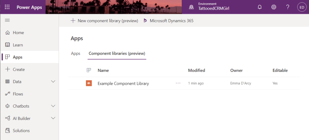
Now if we navigate back to our Solution in the Maker Portal, we will see the Component Library show up:
Now we have our Component Library in our solution, we can export the solution and import it elsewhere for use!
 Mx Em D'Arcy
One thought on “Power Apps: Adding the Component Library to a Solution”